In 2003 a small 6 card promo set was released by Cards Inc, which heralded their trading card set that was going to make a lot of 2000AD fans very happy. This card set was to be called, The Art of Judge Dredd!
Sadly the mistakes on two of these cards made me wonder what was going to happen when the full set hit the shops. I'll help you out by telling you it's the artists mix up for cards 5 and 6, basic checking, terrible!
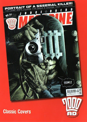
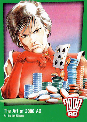
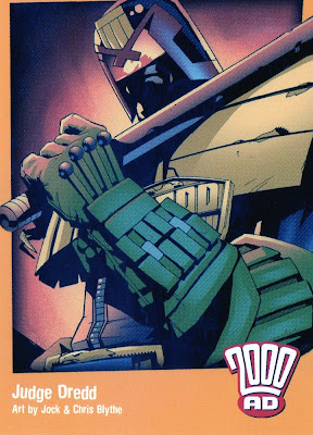
A few years had passed before we heard any more info about these cards and by then the company had changed and the name of the set. It was now called 30 Years of 2000AD and Strictly Ink was now in charge of the series. They released these 3 cards to let the fans know the set was imminent in 2007.
Now it was time for the release of this highly anticipated set and so I put an initial order in for 4 boxes. When they arrived in the summer of 2008, I carefully opened them and I managed to make a few complete sets and I gained a few sketch cards, the first one being Judge Giant by Rufus (those are talked about in detail on another blog). Every box was numbered, as you can see below and overall it's a good design layout. The way Dredd with the sunburst behind sticks up is well thought out. I think each box cost around £25, at first!
Also nice to see the product is manufactured in the UK.
It wasn't long before the prices came tumbling down for the boxes and cases, mainly because the fans were not happy and word spread that the set was, lets be kind and just say flawed! I opted for getting a case for Christmas as there was no other 2000AD merchandise out there! Also if you bought a case you would get a couple of ultra rare sketch cards included. I had none in mine so emailed the company and they sent 2 Cliff Robinson sketch cards out to me, RESULT!
The folder was another nice design, even if it was way too big to hold just the series one that it advertised on the front cover.
Now we come to the set itself. Of the first nine the header card looks out of place in the folder. The rest of the cards are excellent, using some of the best 2000AD artists around to draw you in with their art.
On the rear of the first 9 cards is the cover of the first ever issue of 2000AD, once you lay the cards out as shown below!
Next up is the Classic Covers. Now this is a strange mix in my opinion, not due to the artists but the progs chosen and also why did they cut the borders from some of the front covers? I also think it would have been better to have had a cover from every new logo era that 2000AD has gone through.
Nice info on the back which will help anyone who has never read 2000AD.
Next up is The Art of 2000AD. What a superb bunch of pics and artists we have here, showing us a mix of characters old and new. I like the way the characters on the front cross the black outline into the green border but don't on the back.
Now we have the next subset and I don't understand why we have a coloured card in the top corners, but it is symmetrical. Again we have another excellent array of art chosen.
On the back we have a superb Kevin Walker pic. Two points, could no's 33 & 36 not have had their numbers placed to the left and could no 35 not have been placed at the bottom right, as it's on Dredd's head! It's these little things that show the lack of thought sometimes.
Next up is the Snap Shots selection. More excellent pics and also great to have the info on the back. One minor point, most 2000AD readers will know the artists on cards 37,38,39,41,42 & 45 are the same as on the front, but just to help the uniformity they could have had their names included, as the other 3 have names on.
This subset is extremely weird. Kev Walkers drinking image on one side, well only part of it and not putting the other part on the rear but a Dante image instead. Why?
This orange art set is brilliant, with some of the greatest ever 2000AD artists showcasing their art, and it again crosses over the border.
On the back we have the left side of Kev Walker's drinking pic, slightly spoilt by white numbers and their placement. Again an odd choice having broken the image up and not using it on the previous subset of 9.
This set of 9 cards is just a complete waste in my opinion. Cards showing sketch cards that you can collect with the set, just what is the point of that?
They even manage to get the name wrong on the credit on the front of card 65!!!
I notice they don't include the 'non' 2000AD artists in this lot, I wonder why!
Next up are the 2 checklist cards.
The set ends on this gold embossed subset with the covers of the annuals for both 2000AD and Judge Dredd and its in chronological order, which is nice. On the back is a Dredd picture by Carlos Ezquerra.
Overall an interesting effort but with way too many mistakes and not enough thought put into the actual layout of the cards and what to put on them. I mean those 9 cards with the montage on the front and back, aaargh!
As said earlier the prices came down for this series as it just didn't sell, so Series Two never came to fruition.
Sadly great art couldn't save this badly thought out series, in my opinion!








.jpg)



Great post - good work that man!
ReplyDeleteSo I shouldn't buy the one in my LCS?
ReplyDeleteIf you would like a set Ken I'll have a look through my spares as I'm sure that I still have a few complete basic sets and I'll send you one up.
ReplyDelete